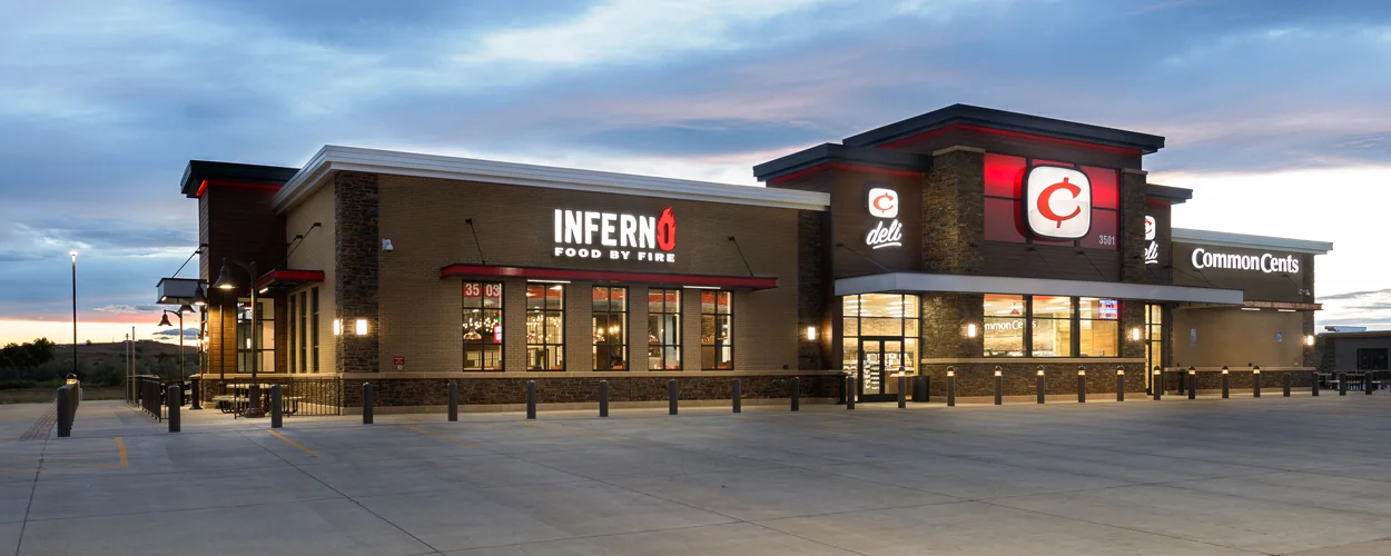
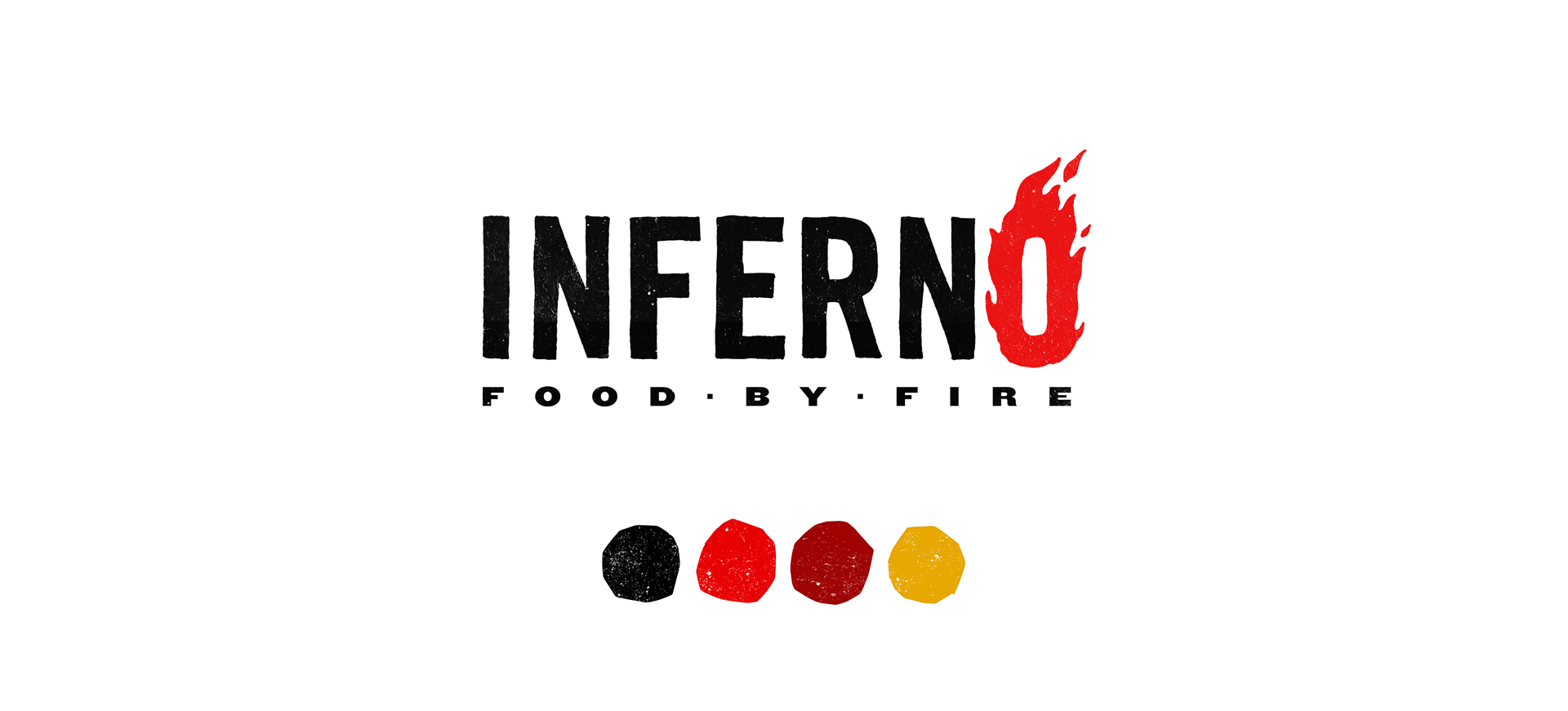
Inferno
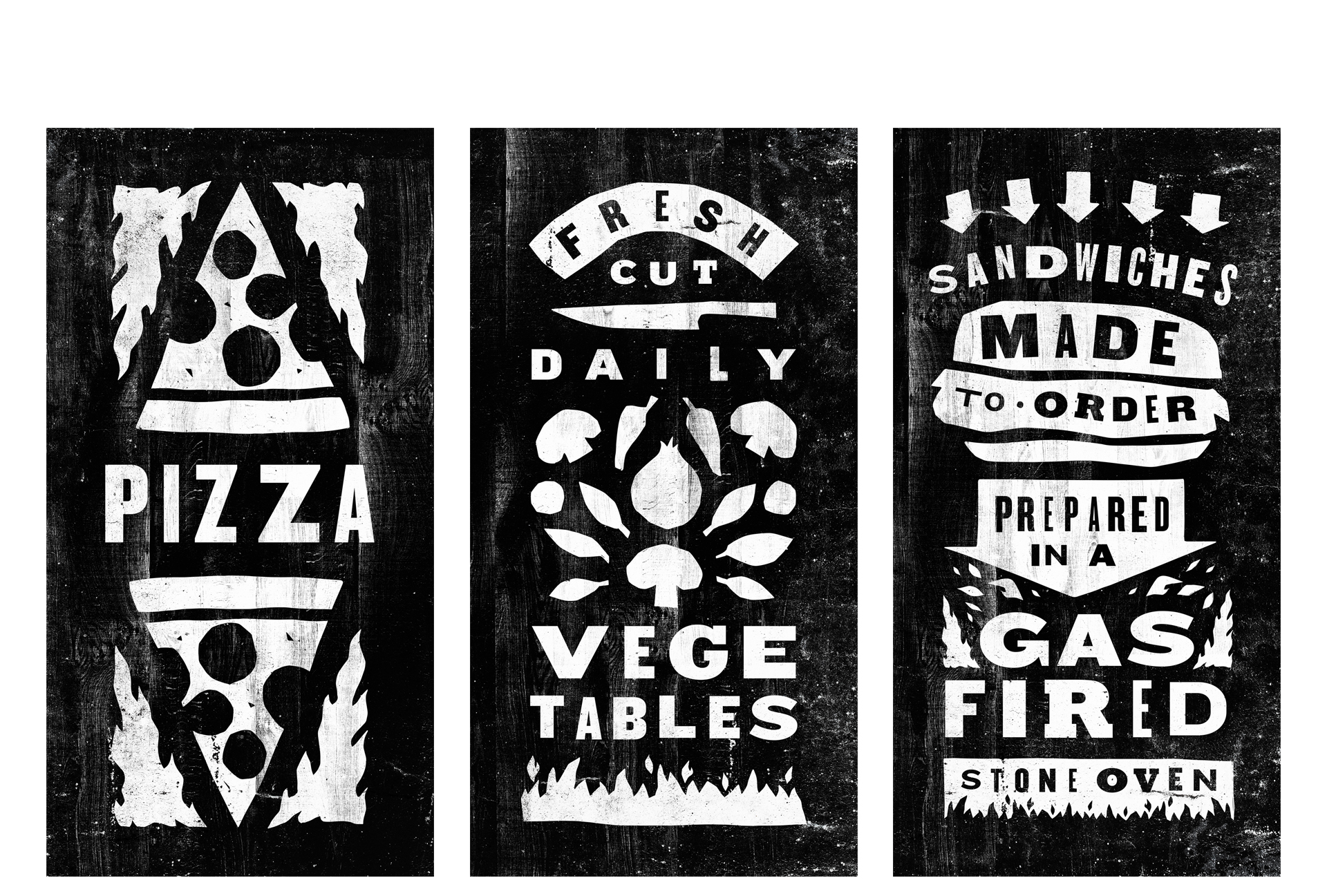
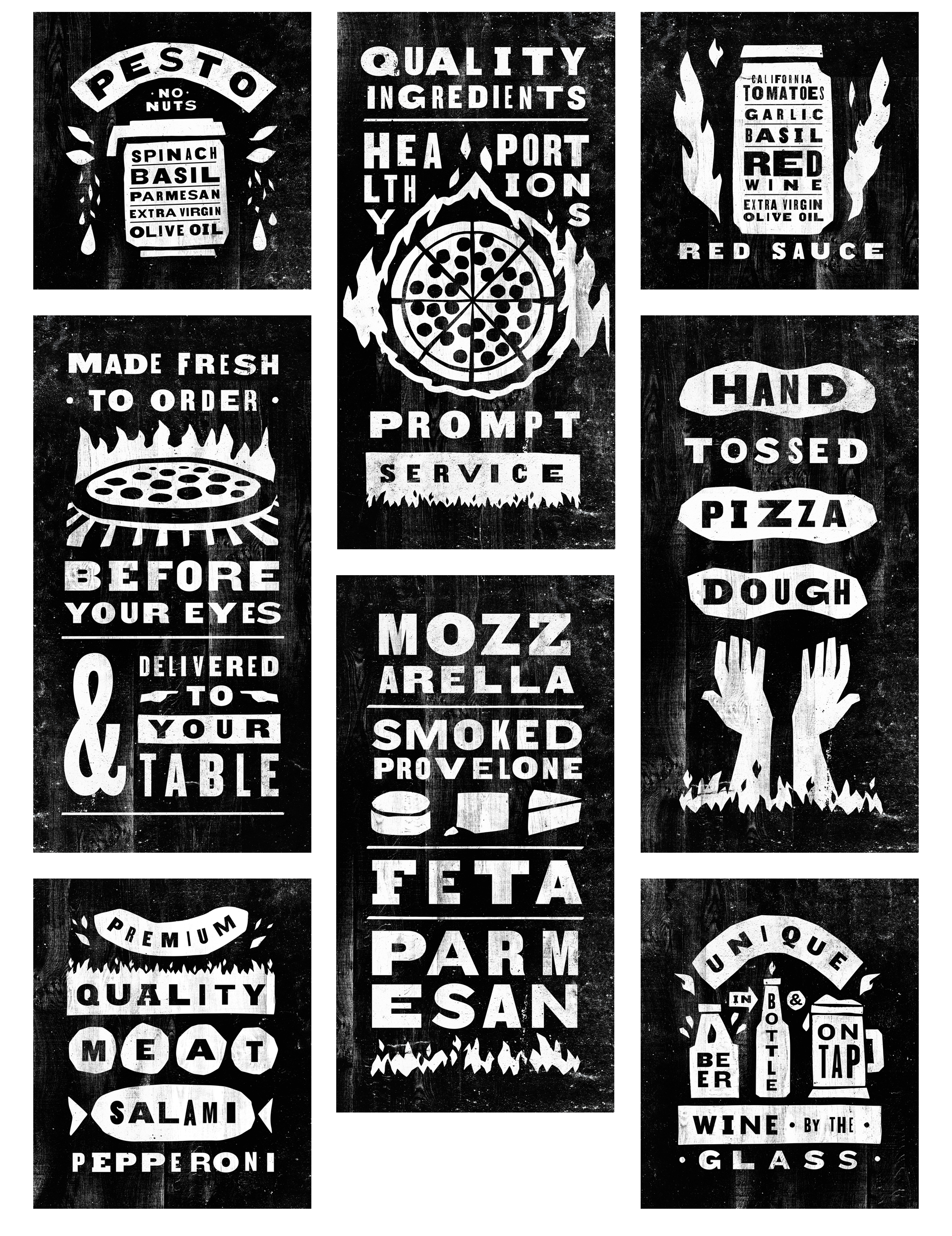
We have worked with these owners on various restaurant venues since the 90's. They wanted to develop a prototype for a fast casual fired oven pizza concept, as an adjunct to their state of the art convenience stores. The team included a menu consultant, equipment designer, architect and us. Part of our scope was to recommend names, and create the branding program, for which we enlisted the services of Twin Cities graphic designer Andrew Beckman. Inferno was chosen from a multitude of name options, and we added the tag line "Food by Fire."
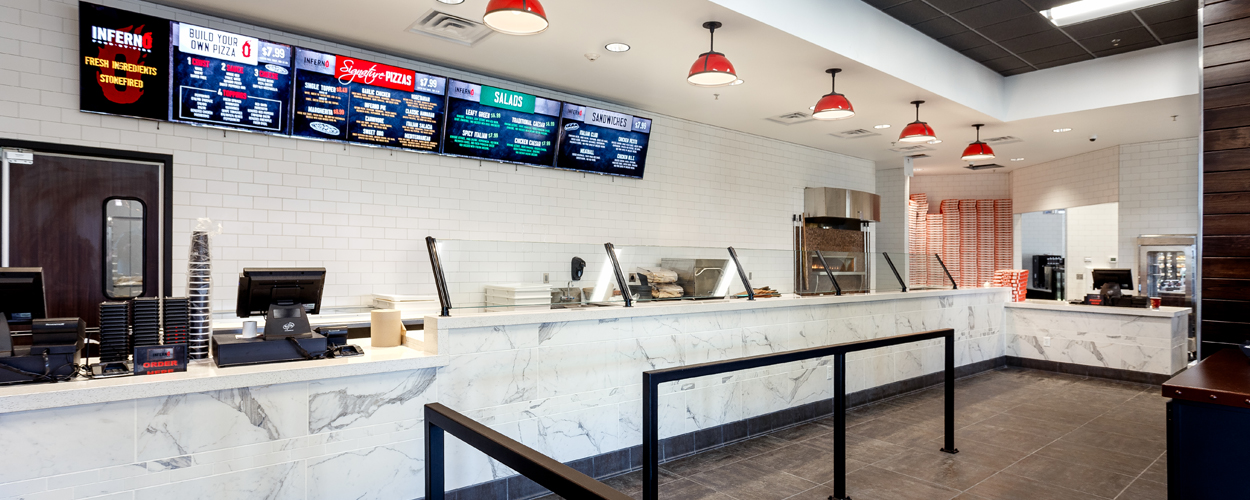
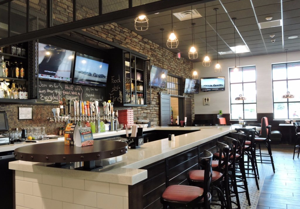
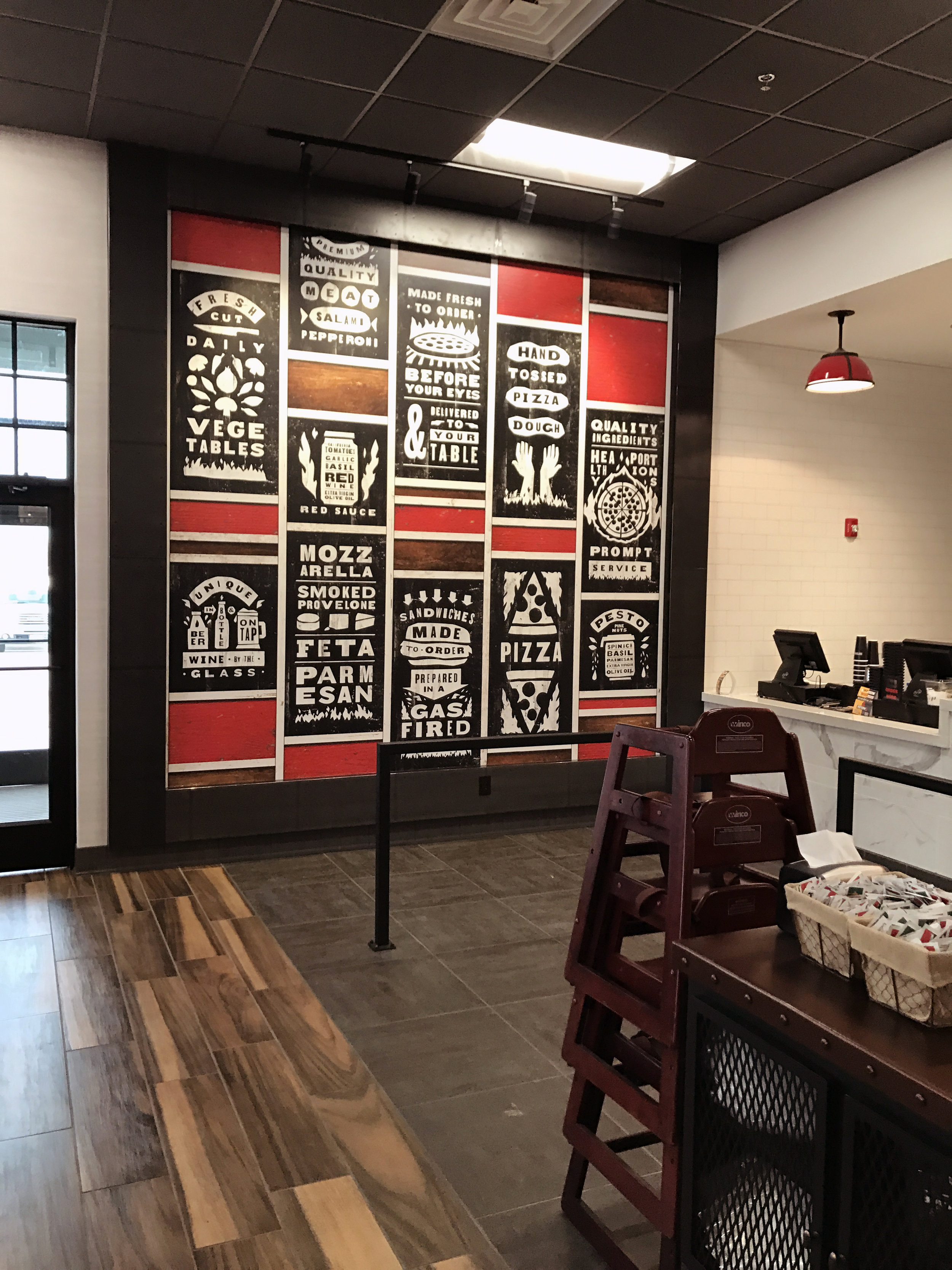
Inferno has three distinct zones, each with their own character, including the ordering area, dining room and a cozy bar - featuring craft brews. The interiors and graphics were developed simultaneously resulting in the cohesiveness of all visual elements. A modern aesthetic with a subtle nod to Sicily was chosen, expressed in a palette of natural materials such as wood, Carrara marble, antique black metals and warm copper. "Inferno" red hues accent the furnishings and graphics.
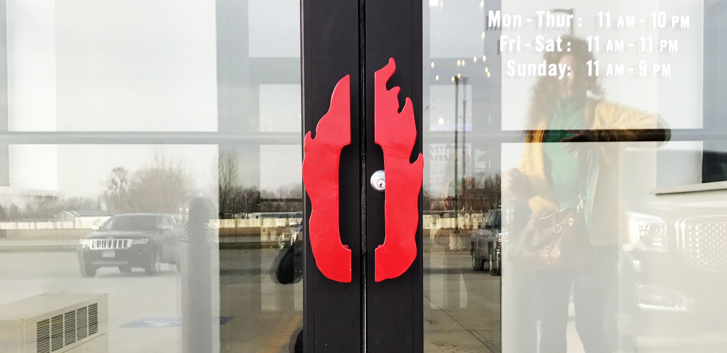
We custom designed all cabinetry and millwork, along with feature design elements such as the entry "pizza slice" wall sconces and "flaming O" door pulls. A large wall graphic in the order area was created to express the brand's core values while adding a strong decorative element to the space.
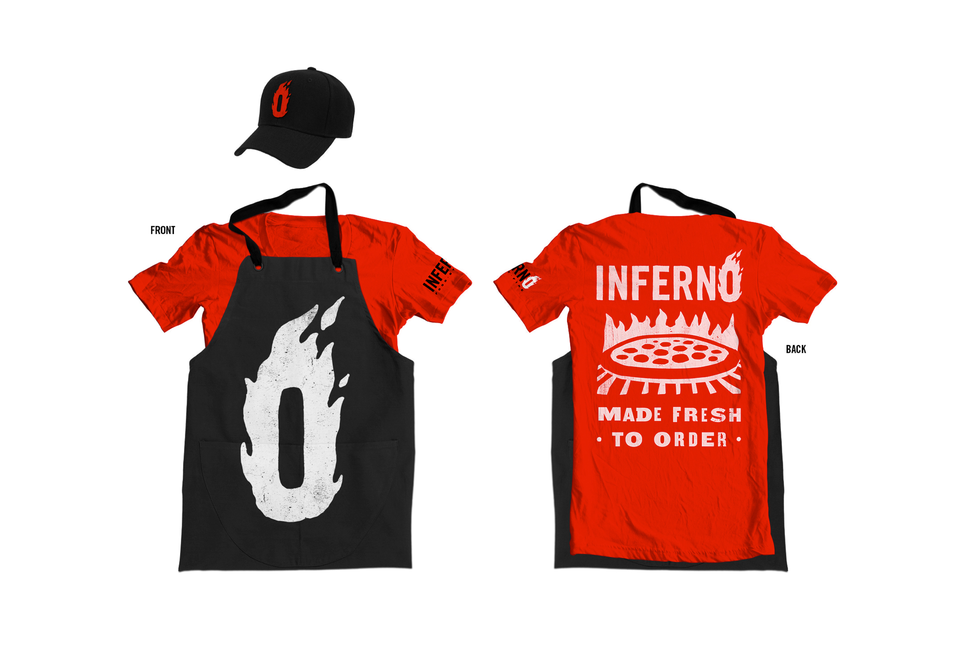
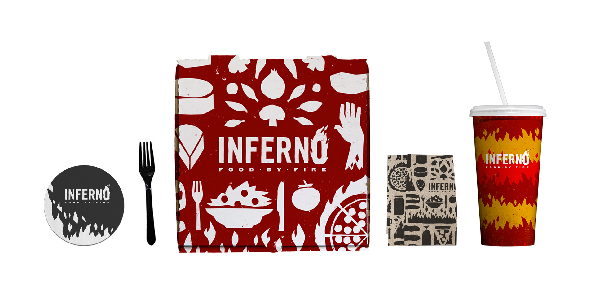
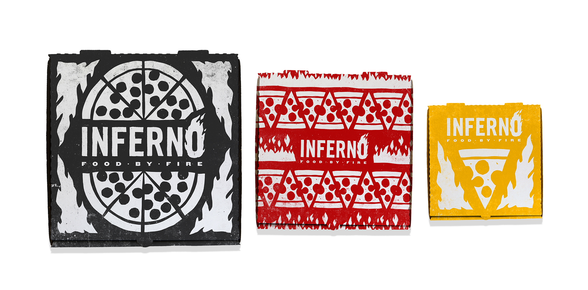
Pizza boxes, soda cups, tee shirts, napkins and pens were included in the graphics package, resulting in a totally inclusive identity for this new brand.