Best Western Premier
We were contacted by a past hotel client to assist with renovating their newly acquired 125 room hotel located on Nicollet Avenue in Burnsville, MN. Their intention was to re brand it as a Best Western Plus. It had been a strong performer in earlier years, but occupancy levels and F&B sales had severely declined prior to their purchase.
This hotel had been constructed in the mid 80's, and despite having a highly visible site presence and good bones, turned out to be suffering the ill effects of many years deferred maintenance, which were not readily apparent to the new owners. The repair/replacement costs for boilers, chillers, and other necessities greatly eroded the budget earmarked for the interior renovation. Therefore, we felt greatly challenged to create a product that would meet the brand standards, within the remaining budgetary parameters.
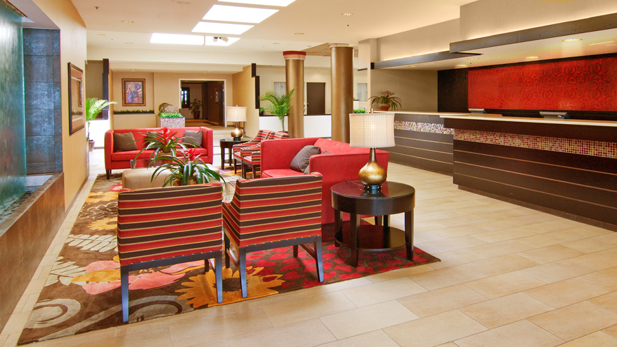
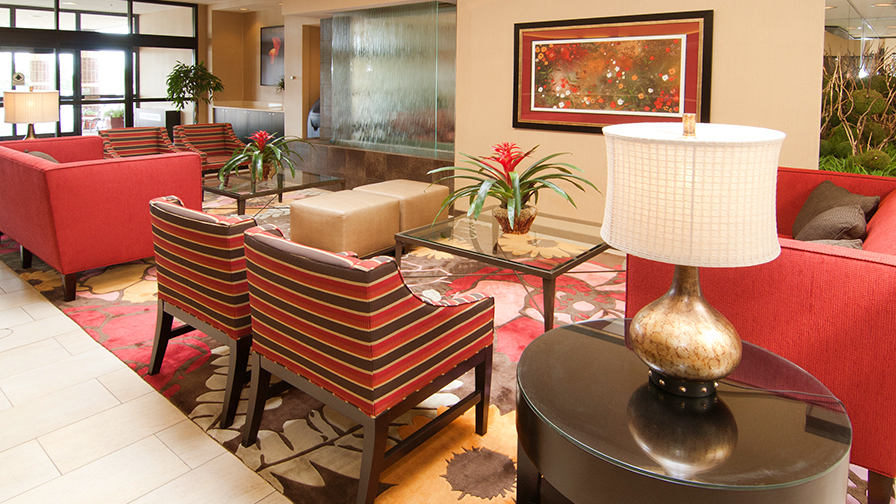
It has been said that "color and smarts don't have to cost extra"…and we put that philosophy to good use for this hotel. Because the owner loves a red and chocolate brown combination, they became the basis for our color palette. The public spaces contained many skylights that had been covered over by the previous owners, giving them a gloomy, oppressive feeling, and there were many existing interior architectural planters affording us great design opportunities.
Covered skylights were unearthed, public spaces were painted a bright airy white, and the carpet was replaced with large format sandstone tile. Existing architectural planters were covered with red and amber glass mosaic tile, backed with mirrors and planted with whimsical topiary trees. The existing front desk was re-clad in horizontal wood planking with gold accents, and a red beaded tile mural became a stunning backdrop to it.
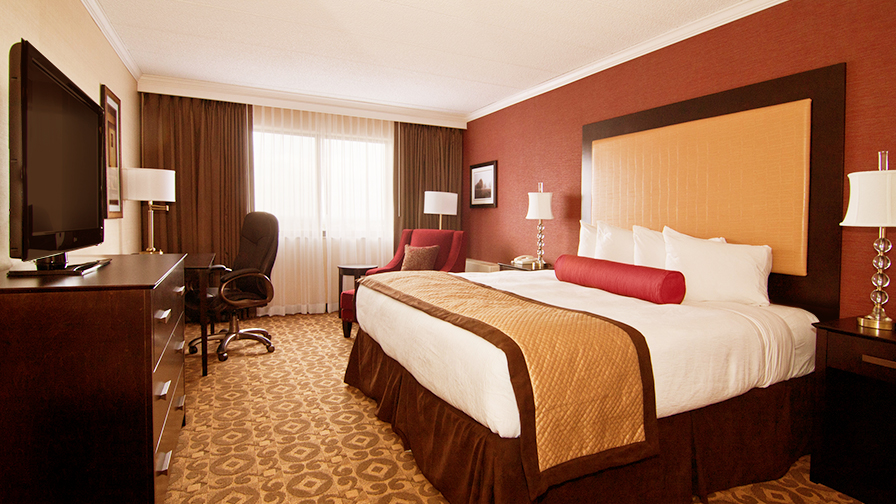
We designed custom lobby area rugs with brightly colored floral patterns, upon which sleek modern seating is placed. We reworked the space plan to include a water fountain feature in the lobby. The aesthetic of the public spaces was carried into the guestroom corridors, and the rooms themselves. Predominant colors are chocolate and red, with accents of ivory and camel. A collection of abstract and floral wall art by contemporary artists was curated by the design team to augment the colors, and contribute to the happy vibe.
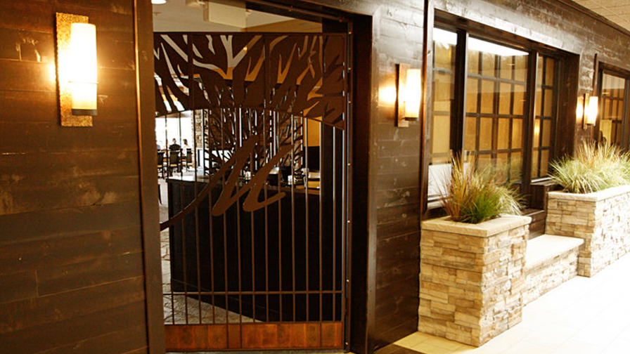
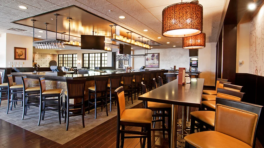
Designed to pay homage to Joseph Nicollet, the bar and restaurant have their own unique character. The materials are natural and organic in nature, reflecting the era of this early explorer, trader and mapmaker, for whom the Nicollet Avenue, on which this hotel is located, was named. One of Nicollet's maps was reproduced and is predominately displayed as a wall graphic.
Something very special happened when this design was presented for brand review: Due to the quality of the interior design, the hotel became a Best Western Premier, their top of the line.